Sign in

ScatterBrainPlots

@scatterbrainplots.bsky.social
30 followers 104 following 8 posts

It usually could have been a pivot table. Professional chart stalker turned amateur data artist. Here for the viz vibe 📊

PostsRepliesMedia
ScatterBrainPlots @scatterbrainplots.bsky.social · 14/12/2024
#TidyTuesday - The Scent of Data User rating heatmap of 23 main accord pairings in this week's Parfumo data set. Surprising absolutely no one, Synthetic as a primary scent note is not particularly popular. #rstats | #ggplot2 | #DataViz
070
Reposted by ScatterBrainPlots
Dan Oehm @danoehm.bsky.social · 10/12/2024
#TidyTuesday week 50: The Scent of Data Word clouds of the main accords, base, notes, middle notes, and top notes for the top 50 rated perfumes. Spicy, woody, oriental, floral, and sweet are the most common characteristics. 🔗 github.com/doehm/tidytues #Rstats 📊 #dataviz
0263
ScatterBrainPlots @scatterbrainplots.bsky.social · 05/12/2024
Knowing Spotify Wrapped was imminent I spent a bit of the thanksgiving down time tinkering with my historical listening data. Maybe i should have bought better headphones on black friday given the amount of time i use this app. #Spotify #Wrapped #RStats #DataViz #ggplot2 #spotifywrapped
072
Reposted by ScatterBrainPlots
Prof. Emily Nordmann @emilynordmann.bsky.social · 05/12/2024
There was a tweet a few years ago that said Spotify Unwrapped must be one of the most profitable uses of group_by() and summarise() and it just lives rent free in my mind at this time of year #rstats
3826
Reposted by ScatterBrainPlots
Michael Friendly @datavisfriendly.bsky.social · 30/11/2024
#TodayinHistory #dataviz #Onthisday #OTD 📊 📅Nov 30, 1826 Charles Dupin presented the first #choropleth #map, showing rates of literacy in France 🇫🇷 A key development in thematic cartography! It showed that social ('moral') variables could be mapped & made subject to intelligent discussion/analysis.
Dupin's choropleth map of France showing literacy (well, proportion of conscripts who could write their name) by department. Darker shades = lower literacy.Portrait of Baron Charles Dupin sitting at a desk, with his map on the table top underneath a book.
0258
ScatterBrainPlots @scatterbrainplots.bsky.social · 27/11/2024
#TidyTuesday (ish) -- Thanksgiving break gave me some time for an extended sesh with this CBP dataset (via @dslc.io / Tony Galvan) First up: Monthly encounters by processing authority (Title 8 vs Title 42). #rstats, #ggplot2
171
ScatterBrainPlots @scatterbrainplots.bsky.social · 26/11/2024
Finding all these data viz accounts on Bluesky has been such a breath if fresh air
media.tenor.com
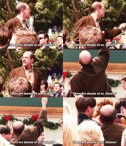
a man in a suit is talking to a group of people and says " there are dozens of us dozens "
ALT: a man in a suit is talking to a group of people and says " there are dozens of us dozens "
010
Reposted by ScatterBrainPlots
Jon Harmon (he/him/his) @jonthegeek.com · 26/11/2024
DSLC.io welcomes you to week 48 of #TidyTuesday! We're exploring U.S. Customs and Border Protection (CBP) Encounter Data! 📂 tidytues.day/2024/2024-11... 📰 gdatascience.github.io/us_border_pa... Submit a dataset! github.com/rfordatascie... #RStats #PyData #JuliaLang #DataViz #tidyverse #r4ds
Logo for the #TidyTuesday Project. The words TidyTuesday, A weekly data project from the Data Science Learning Community (dslc.io) overlaying a black paint splash.A stacked bar plot (created by Tony Galvan, but inspired by @fentasyl on X) showing monthly inadmissible CHNV (Cuban, Haitian, Nicaraguan, and Venezuelan) alien encounters by U.S. Border Patrol agents from 2020 to 2024, based on data from U.S. Customs and Border Protection. Bars represent total monthly encounters, with the blue portion indicating Southern Border encounters and the red portion indicating Interior encounters. From 2020 to 2022, encounters are consistently below 10,000 per month, predominantly at the Southern Border. Starting in 2023, encounters surge dramatically, ranging from 10,000 to 60,000 per month, with Southern and Interior encounters roughly equal. The data appears inaccurately low for late 2023.
0242
Reposted by ScatterBrainPlots
Hadley Wickham @hadley.nz · 25/11/2024
I'm writing up a brief history of the tidyverse? What do you want to know about it? #rstats
83521111
Reposted by ScatterBrainPlots
the Mountain Goats @themountaingoats.bsky.social · 23/11/2024
people say no obsession or hobby will fill the emptiness inside or do the work of repairing the hurt we carry. you know what kind of people say this. quitters
371156221
ScatterBrainPlots @scatterbrainplots.bsky.social · 23/11/2024
Channeling my data hoarding and college R class into something semi-productive. Starting a data viz journey with DC Airbnb reviews because I guess I enjoy pain & watching housing markets implode. Spent a concerning amount of time adjusting axis labels #dataviz #rstats #DChousing #thisisfine
090
Reposted by ScatterBrainPlots
Sharon Machlis @smachlis.bsky.social · 23/11/2024
The {scico} #RStats 📦 is new to me! scico features “39 different palettes, all of which are perceptually uniform and colourblind safe. An overview can be had with the scico_palette_show() function”. By @thomasp85.com github.com/thomasp85/sc...
github.com
GitHub - thomasp85/scico: Palettes for R based on the Scientific Colour-Maps
Palettes for R based on the Scientific Colour-Maps - thomasp85/scico
212529
Reposted by ScatterBrainPlots
Saloni @scientificdiscovery.dev · 20/11/2024
Since I've been here for a while… here are some useful features on Bluesky that you might not have discovered yet! 🧵
2531521584
Reposted by ScatterBrainPlots
Our World in Data @ourworldindata.org · 22/11/2024
Fossil fuels are the biggest source of CO2 emissions in most countries, but there are a few exceptions
617153
ScatterBrainPlots @scatterbrainplots.bsky.social · 22/11/2024
sup, world
000